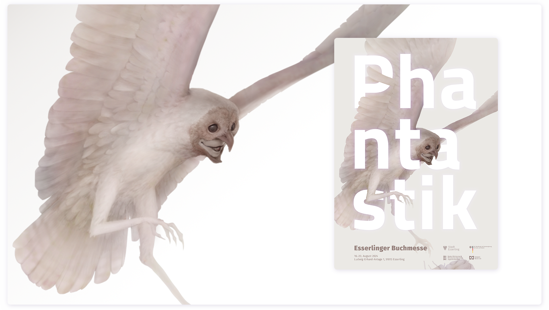



My responsibility:
define key emotions for the ad campaign
define visual guide
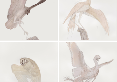
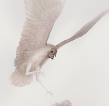
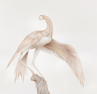
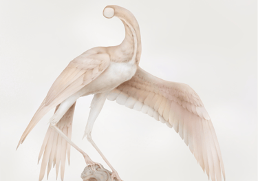
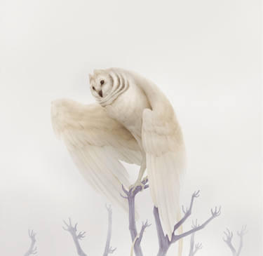
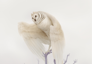
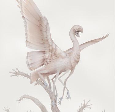
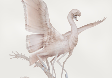
explore creature design possibilities
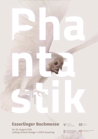
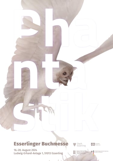
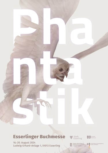
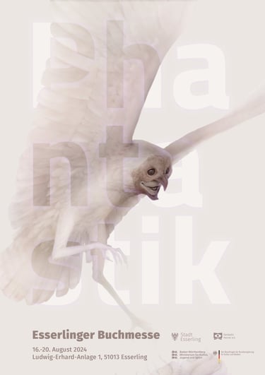
create final advertisement illustrations
// explore creature concepts
// produce final ad assets
Project description
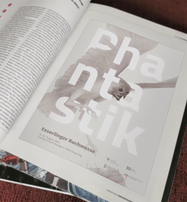
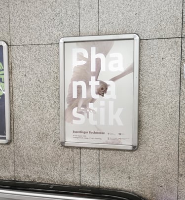
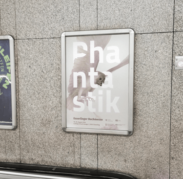
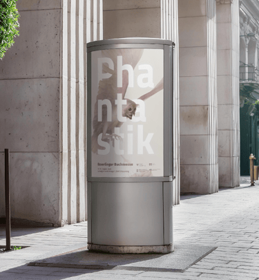
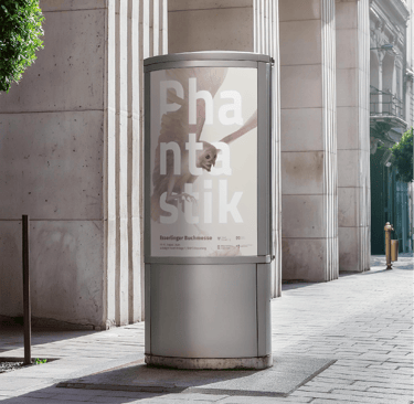
The team behind the "Esserlinger Buchmesse" wants to increase visitor counts for their expo. Their sales team decided to advertise their represented genres with individual campaigns in digital and print, showing off selected authors.
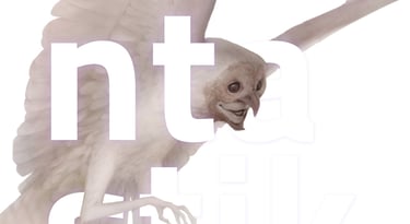
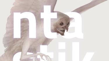
With the general layout settled my responsibility was to translate the mood of a specific selection of their newly acquired author additions into illustrations.
Deliverables:
design guide
exploration sheet
final assets for digital and print
Client: Esserlinger Buchmesse
Date: 2024
Task: digital + print advertisement
to promote our bookfare

1
Strategy
2
3

2: Setting direction for general mood, style and setting for the app with first design options for our main character: Lino. Exluding colour to enable efficient discussions on form language and expression.
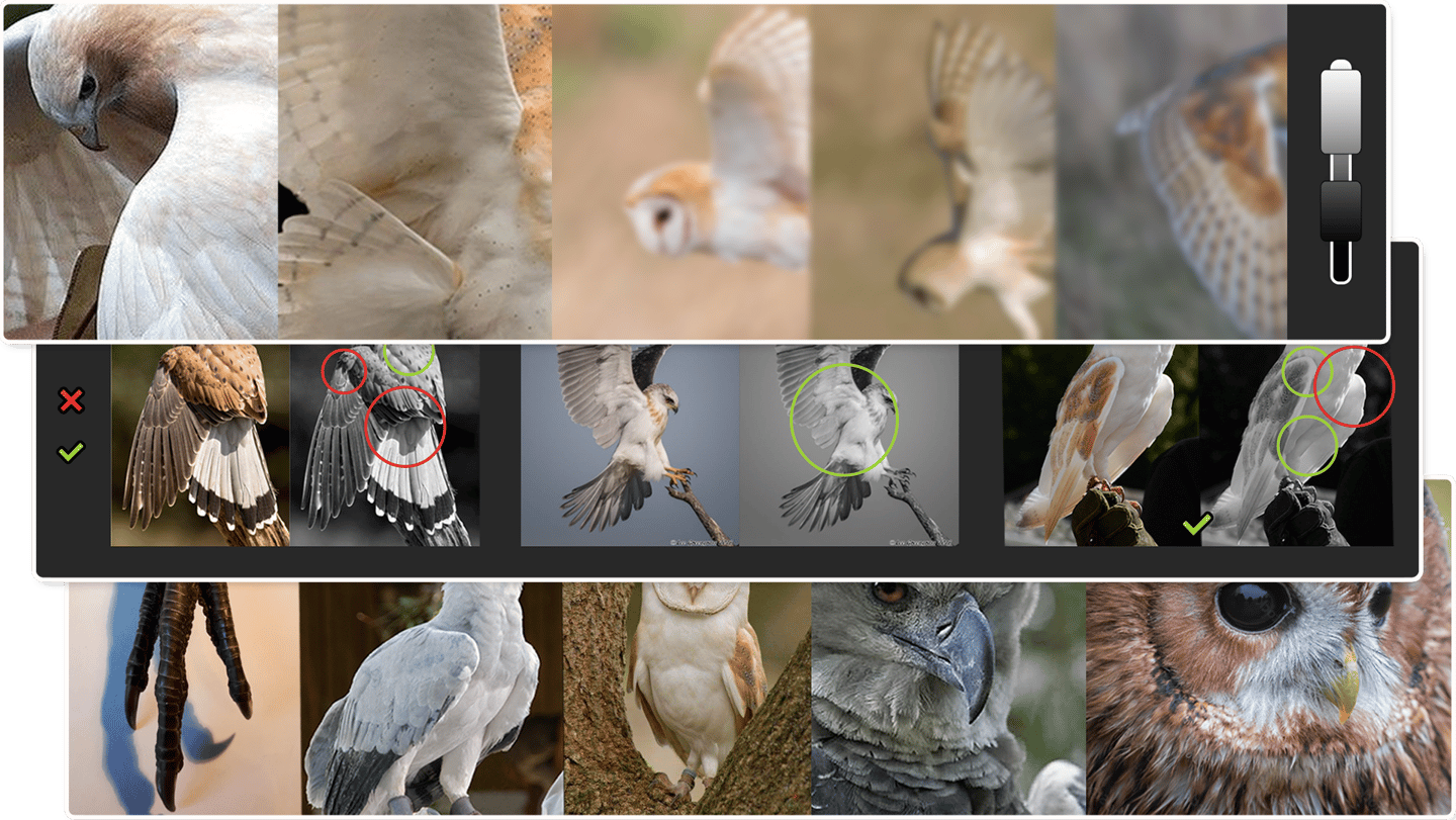
2: Development of first character drafts to finetune choices into a final version
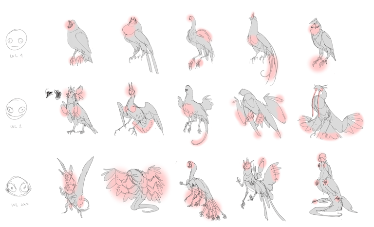
Deliverables
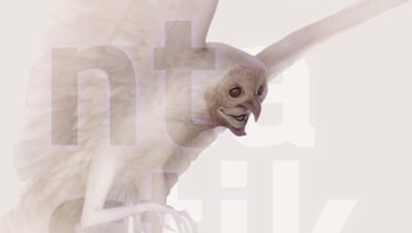
2: Adding options for a bird side character for a speaking module
2: Adding options of a side character of a second speaking module
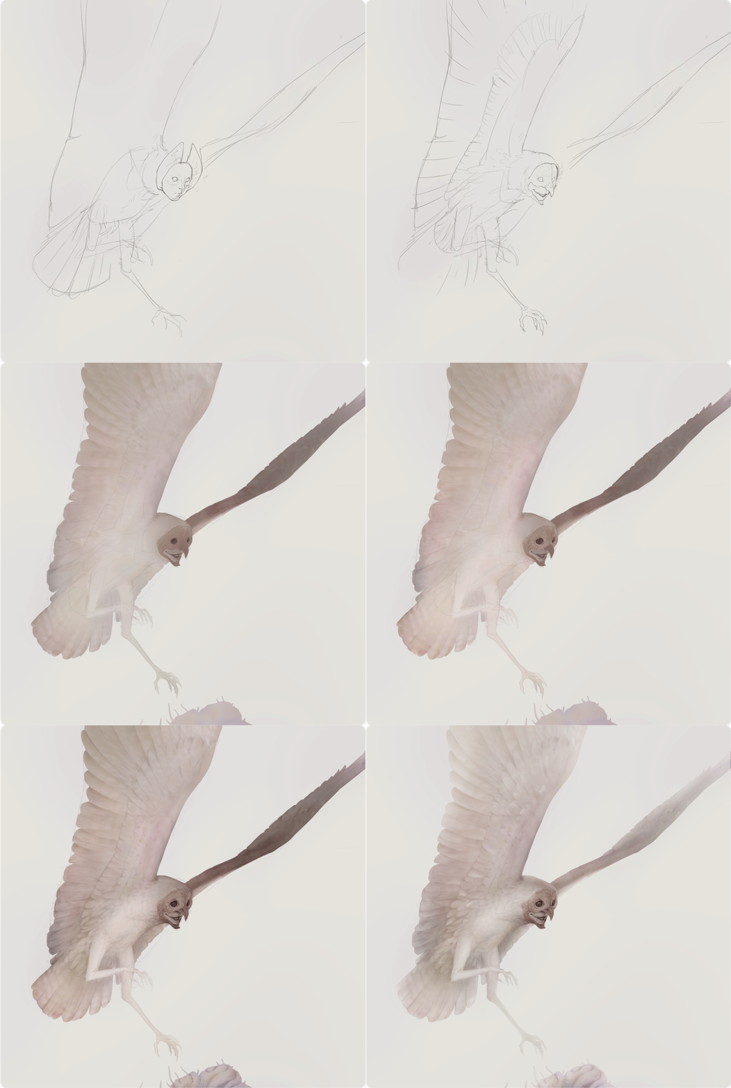
2: Adding options of a side character of a second speaking module
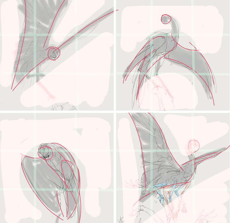
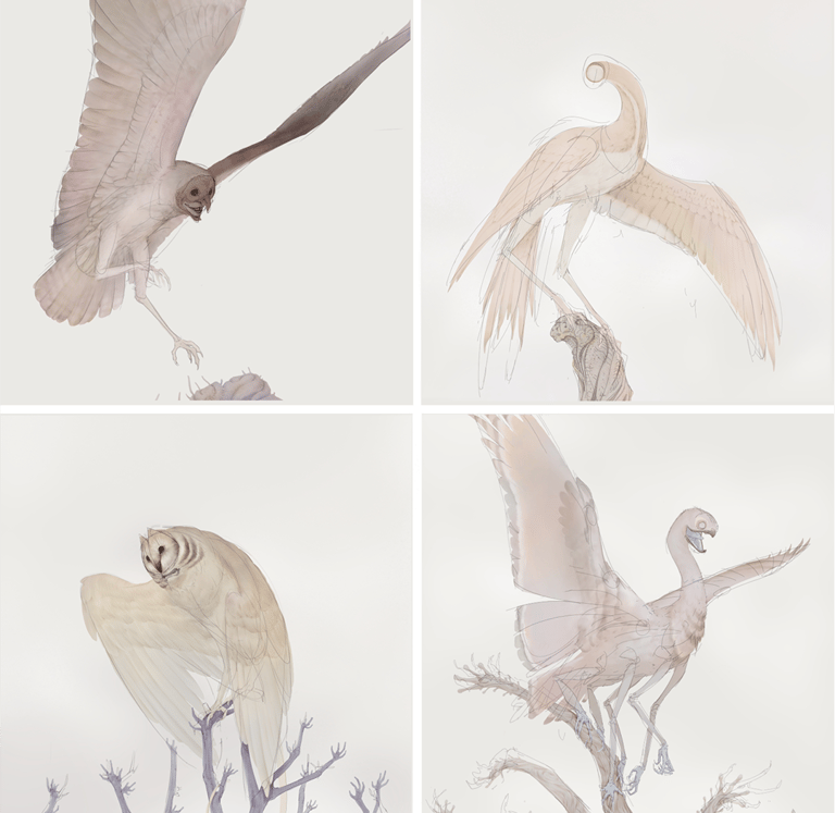

Afterthoughts
Challenges + workourounds
Bridging the Experience Gap
As the sole designers on this project, our role extended beyond execution into strategic guidance. We focused on establishing a transparent process so that decision-makers could evaluate the long-term effects of each design decision with confidence before moving forward.
━━
By isolating visual concepts into core design components— eg. form, palette, and emotional tone—and contextualizing them with competitor audits and available budget, we created a shared understanding for the entire team. As a result, decisions were made confidently on the first pass, completely eliminating the need for structural revisions.
━━
Efficiency through Validation
With a lean budget, I sought to streamline our design pipeline, finding ways to eliminate redundant operations while ensuring the project owners remained fully informed at every stage.
━━
I suggested to adapt a design system akin to how CSS styles a HTML code: The main character and the first module of the app functioned as a approved master guide for all visual direction choices, allowing us to leap from initial sketches directly into high-fidelity production for the rest of the project. This way, we reduced alignment meetings and iterational work without sacrificing quality or consistency.
━━
Thank you Mona and Hanna for allowing this project to be displayed publicly!