


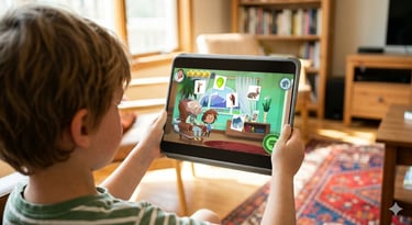
// decide visual direction
// explore settings + characters
// develop frontend
• project outline
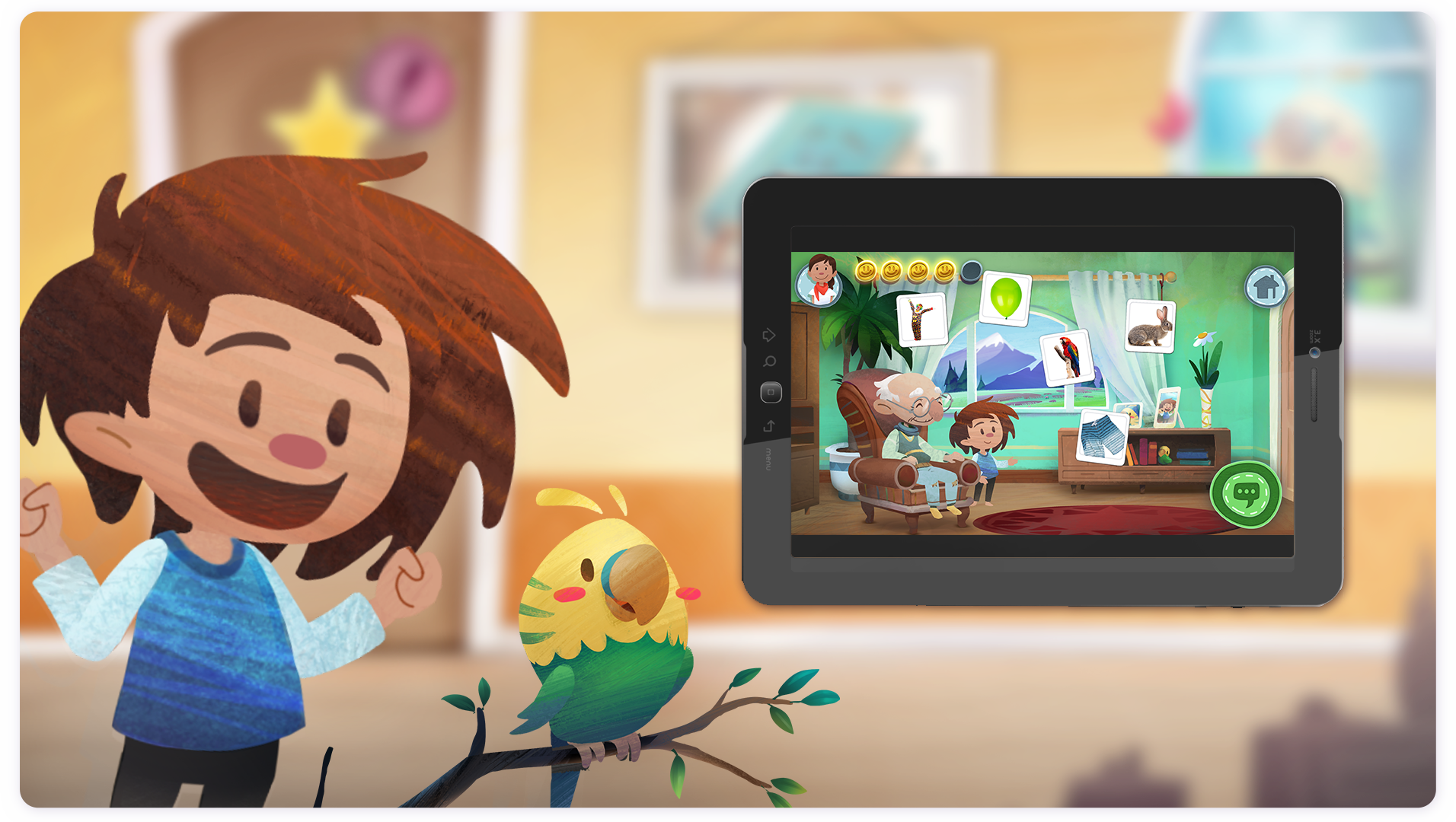
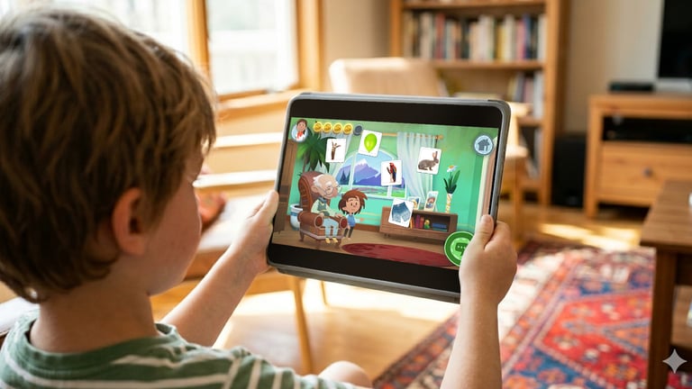
Speech therapists Dr. Hanna Jakob and Dr. Mona Späth successfully secured government funding to develop "Neolexon", a medically certified articulation app for children.
While their startup, Limbedix GmbH, provided the clinical expertise, they partnered with co-designer Reiko Groß and me for strategic planning and production of the app's frontend. Through subsequent fundings we could continue collaborating on further content, delivering a total of 5x modules, 1x home and 1x backend interface.
Client
Date
for our speech therapy app
Limbedix GmbH
2019-2021

1
• process
2
3
1 Analysis: Analysing app stores from a user's point of view. Goal: Understand visual representation choices of competitors in order to position Neolexon's store page with recognition and differentiation in mind.

2 Exploration: Collect and categorise feedback in order to understand style preferences better. Example images were sourced from the internet to discuss colour, form, emotions and layout individually.

• deliverables
2: Suggesting a design direction for the app with a draft for our main character "Lino": Animation budget dictated stylisation options, I initiated with greyscale sketches to focus discussions on form and expression. Afterwards, requested colours were applied.
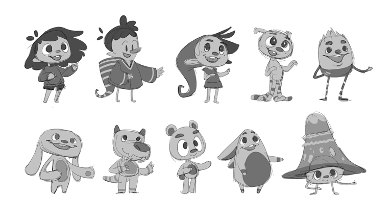


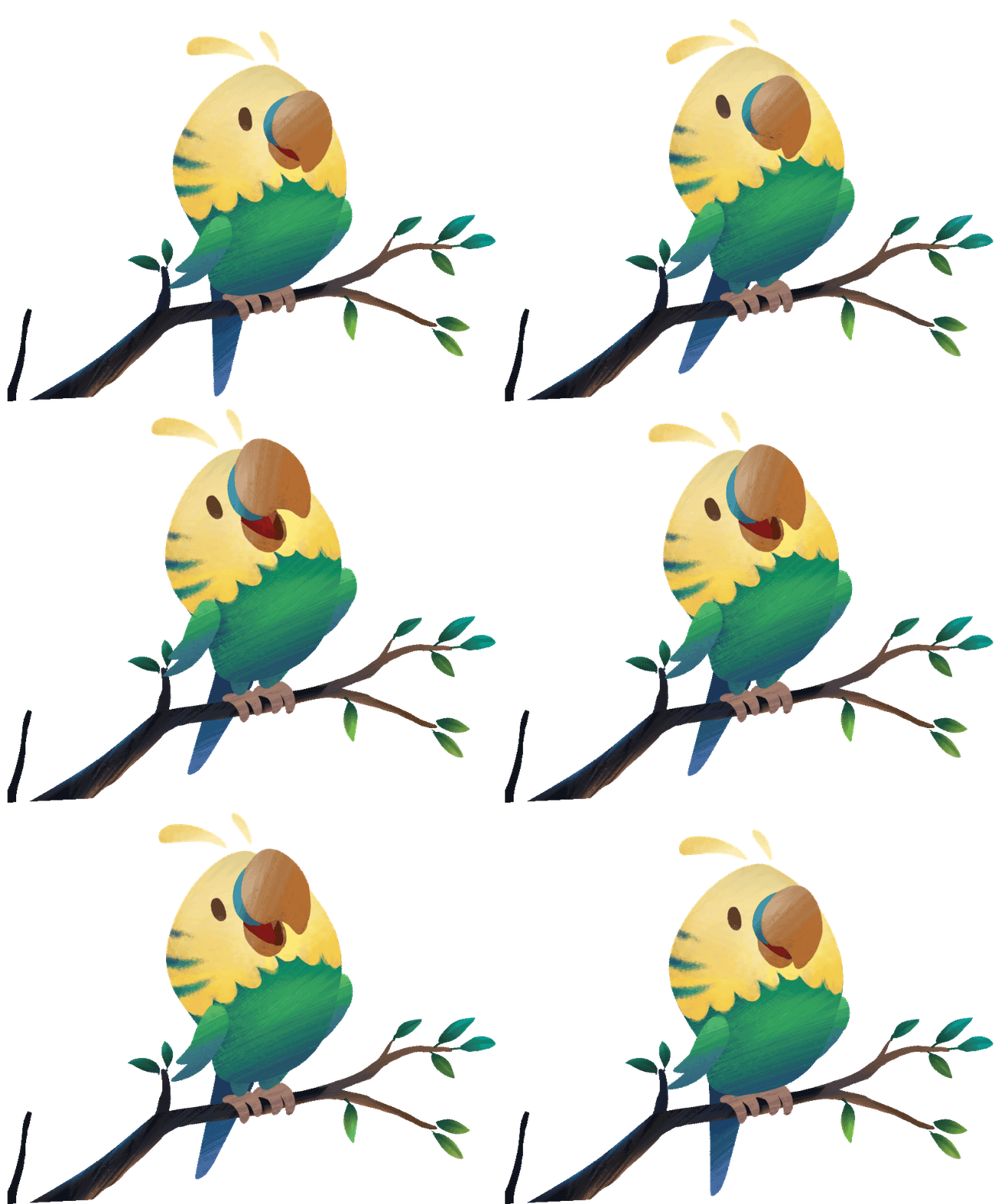
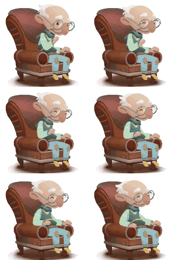
2: Adding options for side characters of our interactive speaking modules:
a bird and a grandparent our patients talk to. With stylisation specified within the main character, these drafts went from sketch directly to finished asset.
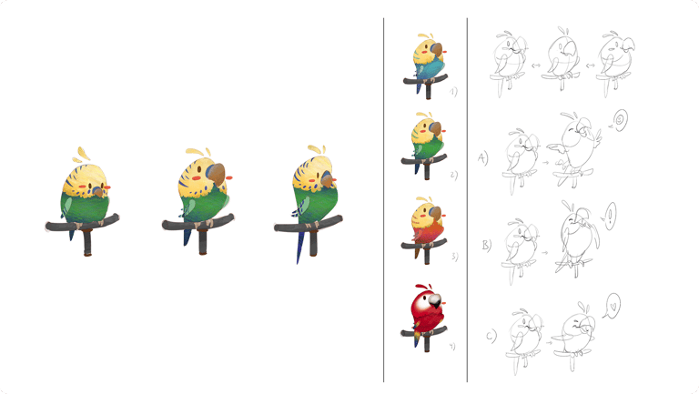

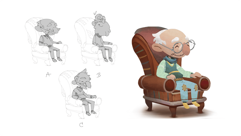

2+3: Concepting first possibilities for module settings.
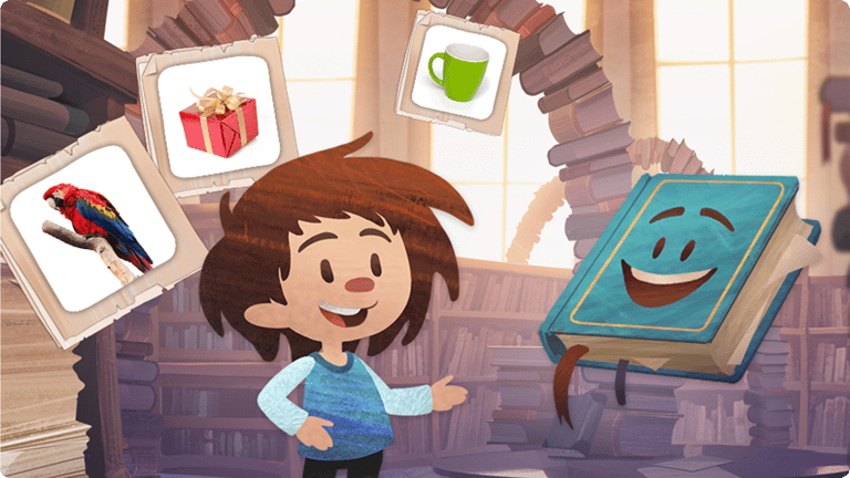
Request: provide divers settings and avoid being too phantastical for a medical app. We went for a total of 6 modules, all cover a broad palette of sceneries whilst remaining approachable for conservative eyes.


3 Production: Creating exchangable character items to incite individualisation. First set with basic items that need to cover divers appearance choices.


3 Production: Creating exchangable character items to incite individualisation. First set with basic items that need to cover divers appereance choises.
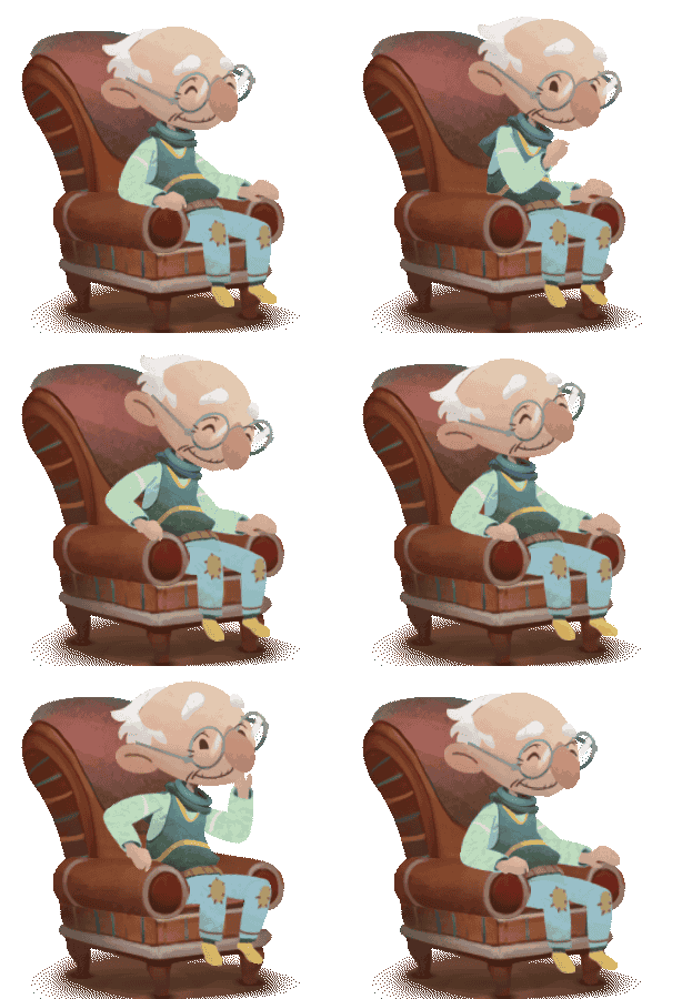

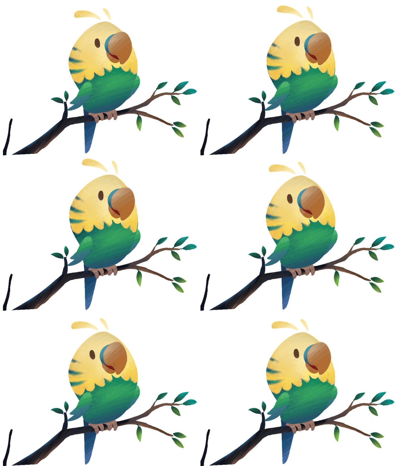

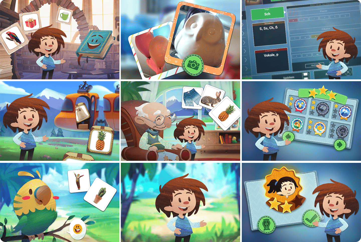
Promotional video online, provided by Limbedix themselves

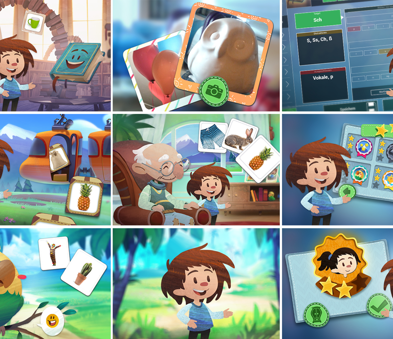
3: Set of promotional assets to be used online
Afterthoughts
Challenges + workourounds
Bridging the Experience Gap
As the sole designers on this project, our role extended beyond execution into strategic guidance. We focused on establishing a transparent process so that decision-makers could evaluate the long-term effects of each design decision with confidence before moving forward.
━━
By isolating visual concepts into core design components— eg. form, palette, and emotional tone—and contextualizing them with competitor audits and available budget, we created a shared understanding for the entire team. As a result, decisions were made confidently on the first pass, completely eliminating the need for structural revisions.
━━
Efficiency through Validation
With a lean budget, I sought to streamline our design pipeline, finding ways to eliminate redundant operations while ensuring the project owners remained fully informed at every stage.
━━
I suggested to adapt a design system akin to how CSS styles a HTML code: The main character and the first module of the app functioned as a approved master guide for all visual direction choices, allowing us to leap from initial sketches directly into high-fidelity production for the rest of the project. This way, we reduced alignment meetings and iterational work without sacrificing quality or consistency.
━━
Thank you Mona and Hanna for allowing this project to be displayed publicly.